Dorian Gray

Dorian Gray

What choices will you make?

We chose to create an interactive version of “The Picture of Dorian Gray” by Oscar Wilde. The idea is to give people a few of the moral choices Dorian would have had to make if he were around today. It will be interesting to see if they do things differently. It may well be that these days the view is more than ever every man (or woman) for themselves. Or perhaps David Cameron’s “Big Society” will triumph?


Career Evolution


Career Evolution

Slogan, logo, business card, brochure.

Career Evolution is a recruitment agency run by people with specialist backgrounds in outplacement, career transition, career management and coaching to support companies and individuals experiencing change of all kinds in the workplace. The company believe that the new constant in the workplace is continual change.  They provide strategies for organisations or individuals preparing for change, undergoing change or just coming out of a change cycle, and wanted a brand identity that reinforced that positioning.

Little existed in the way of corporate literature, which provided me with an opportunity to develop the strategy from the ground up. I wrote the strapline to make the customer the focus of attention. Then I devised the extendable career ladder as a metaphor for the customer’s ever changing position in the job market. The company were very happy with these foundations and from there my better half and talented designer Liz Thorp helped me fulfill the deliverables across a variety of media including business cards, stationary and brochures.

Co-founder of Career Evolution, Sue Thomas, was pleased. “Mike responded immediately with great creative input to the brief I gave and I’m delighted with the results. More importantly, my clients have given excellent feedback without exception. I would highly recommend Mike’s work.”

Commuting is more fun

Advertisment for Slater and Gordon lawyers.

Well, I gave it a go.
The train was too rammed for me to get on the adjoining two carriages, so here I am, three carriages down.
It’s good to see more of our tube cards for Slater and Gordon posted.
“Legal maze ahead” in particular.
A fellow commuter looks at it thoughtfully for some time.
Perhaps she has a case she wants turning into a cause.
Most people are on their mobiles.
Media buying will be glad they bought those digital banners.

Commuting is fun

Advertisment for Slater and Gordon lawyers.

Oh, the joy of the evening commute.

The Jubilee Line at North Greenwich is crammed to bursting.

Nobody looks happy to be there.

Except me.

I’ve see one of our Slater and Gordon tube cards posted in the carriage.

It’s great when you come across an ad you’ve worked on out in the big wide world.

A few of my fellow passengers cast an eye over it.

More interested than they could be, less interested than I’d like.

Perhaps I’ll find a more appreciative audience in another carriage?

I’ll go and see.

Le nom de plume

french_line

I recently spoke to a client who lives in France.
In an effort to clarify the style for a project I said “Ca serai la meme a Cassandre”.

That didn’t clarify the style to them at all.
I thought my French was probably at fault.

In situations like this it usually is.
But not this time.

They had never heard of the great French graphic designer Cassandre.

While I should not be surprised – after all he wasn’t a footballer for example – I’m concerned other French people may be unaware of him.

And frankly I think they’d be missing out.
So if you know any folk from “the hexagon” who may be interested, this is who he was.

Adolphe Jean-Marie Mouron etait un fameux graphiste et designer de type de France.

Mouron etait nee le vingt quatre Janvier mille neuf cent zero en Kharkov en le Ukraine a parents de France. Dans mille cent neuf quinze ses bourgeois famille partaient Kharkov.
Ils ont va a Paris escaper la situation du revolution en Russie.

Adolphe etudie etre un peintre a les Ecole des Beaux Arts quand plusieurs fameux peintre de France a etudient avant. Delacroix, Degas, Monet est Seurat parmi d’autres.
Apres la, la popularite de affiches pour publicite l’aissez lui trouve travaille la.

Il a prit le nom de “Cassandre” sous quelle il a fait affiches.
Il avait l’intention devenir un peintre de chevalet sous lui vrai nom plus tard.

Dans mille neuf cent vingt cinq il designe un affiche il appelait “Boucheron”.
Le affiche etait tres moderne et montait les influence de les cubists, futurists, surrealists
et constructivists.

Il garde le premier prix au Exposition Internationale des Arts Decoratifs et Industriel Modernes.
Ca aide lui a fait un agence publicite dans avec le nomme Allaince Graphique avec ses amis.

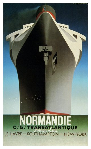
Dan les annees mille neuf trente, par le agence il fait plusieurs du affiches pour l’agence de travel pour qui il est meiux fameux. Maintainent il y a examples classique de que a devenu savent a l’art deco.

Dans mille neuf cent trente sept, Cassandre designed le typeface “Peignot.”
de type printer “Deberny et Peignot.” Le type etait tres innovative parcque il ne fait pas un moins cas.

Dans le seconde guerre du monde, Cassandre a combattent dans les armee francais.

Les Alliance Graphique a termine dans la hostilites.
Dans les anees apres les guerre il etait difficile de lui faire.

Il survi par fait de scene dans la theatre.
Il aussi retourne a le peinture.

Dans lui tard ans, il souffre de depression,
Il se suicide en Paris dans mille neuf cent soixante huit.

Ironically his real name became obscure and his nom de plume became famous.
The opposite of what he hoped would happen.

Despite that it really is a name to remember.

(Apologies to the French accents eliminated in this post).

V&A workshop 2

Second of my storyboard sessions for the V&A, this time with 16 to 18 year olds. I made this brief a lot more specific, with a real product, an oat bar, and a real target market. Again it was well attended and the attendees had to create a concept for a 30 second TV commercial and draw a storyboard for it. The product’s USP is that it contains oats which have a slow release energy to keep you going through the day. There were many good ideas and the standard of drawing was impressive. This was an imaginative answer to the brief, in which a young woman imagines the busy day ahead as a roller coaster ride, the highs and lows of which can be smoothed out by eating the product.

Continue reading

V&A workshop

I held a storyboard class for young people at the V&A. It was well attended by lots of keen young writers, artists and animators. Average age around 8. I talked about an angel fish animation I’d been doing recently, but said they could do their storyboard about whatever they wanted. The Angel Fish began a run on Maritime themes. The story of the sinking of the Titanic was very popular, with astonishing statistical knowledge about the size, number of passengers and lifeboats aboard. The creators of the various stories gave me the casting vote on the true version of events, but refused to abide by my ruling. Understandable really, as my version of events was based on the film of the same name. There were a lot of great storyboards. An imaginative account of the death of a puffer fish was one of my favourites.


Angel Fish


Puffer fish storyboard by Toby

Let there be light

The ad was written, the style set, the Indesign file waiting. Even the idea of the picture was agreed. A view from space of South East Asia lit up. So what was the problem? 6.00 pm and the picture of Asia I had been given was a dark ultramarine with no recognisable features. Fortunately I was also given the name of a photographer/retoucher named Michel Groot. Apparently he could perform miracles. Fortunate, really, as the deadline was next day. After a half hour phone explanation of what was required, he assured me everything would be fine. Early next morning it was my face that lit up as the bright lights of South East Asia appeared on my Iphone.


French Connection

Got a call from a small business, JB Maisons et Jardins en France looking for a logo to go on their outdoor marquee and a business card. They sell flowers and pottery from the 50’s. Combining the two elements into something graphically simple took a bit of working out. In the end they were pleased with the the idea of combining fresh flowers from the garden in a pottery vase. They wanted a free flowing illustration style for the picture so I returned to a rather traditional technique. Drawing on paper. After scanning and some adjustments and type in Illustrator it was pinged overseas and arrived dans un instant.

Continue reading

Horniman Museum

With my improved actionscript skills I decided to try and build a few new banner ads using actionscript. Having previously made a start on an interactive campaign for the Horniman museum, I decided to use it again as a starting point. Surprisingly, the museum has one of the largest collections of musical instruments in the country. It also has some wonderful touch-screens which allow you to see the instrument you want to hear and tap on the image on the screen to hear it play. I created a banner ad which allows you to do much the same thing online. To hear it click on

Instrument Collection Continue reading

V&A Digital Festival

Walking past Giambologna’s “Samson and a Philistine” made for the Medici in Florence (1560) with your design project wrapped in a bin liner can make you feel like a Philistine.

Possibly an imposter. But the staff at the V&A couldn’t have done more to make us feel welcome. Thanks to Andrew and David in particular for the comprehensive choice of easels and mac monitor connectors on offer, and for sticking around the evening before the festival to let us test everything worked. Continue reading